Introduction to R as a GIS
An introduction to using R as a GIS for urban spatial analysis
1.1 Overview
As an urban policy analyst and planner, I have to do a lot of analysis of spatial data. Over the last few years R has become a great way to do many of the basic tasks which would normally be done in QGIS or ArcGIS, and then link them to its powerful statistical tools. But as I’ve learned R as a GIS, I’ve noticed there are few introductions for the types of user cases which are common in my field. This brief walkthrough and the accompanying code should guide readers through some of this territory. My primary aim is clarity in these introductions, and at the same time demonstrating the workflows most optimal for data analysis.
In this introduction I’ll cover mostly data wrangling and initial exploration of some spatial datasets, and how to bring them into relationship with well-established datasets which may already be around, like US Census data. This is a common task for which we use GIS: we have a set of events which are geolocated, and we want to look at these events in relationship to their context. But not only do certain packages in R–particularly simple features spatial data–make all that work faster and easier, they also bring handling spatial data work within the flows of familiar data analysis tasks.
I will cover, then, several aspects of relating spatial data to their context:
- Importing spatial data
- Performing a spatial join
- Visualizing spatial data
- Other operations (a dissolve) and joining to US Census tracts
- Looking for trends with US Census data
Again, these are basic operations; in future posts I’ll explore spatial analysis proper, and deriving actual conclusions from the data. Be sure to go to the project repository to find the code.
Each of these files is available in the “data” folder above. Our workflow will involve:
- Importing the neighborhood boundaries, and importing and wrangling the collisions data to extract collisions in 2018
- Joining the collisions to the neighborhood boundaries
- Creating a summary (specifically, a count) of the number of collisions in each neighborhood
- Visualizing the result
1.2 Importing and Wrangling Data
The data I will be using is available from the City of Seattle, which has made great strides in Open Data practices. To begin, I will use:
- Vehicle collisions data, which is available as .csv file.
- City Clerk data on the neighborhoods of Seattle, specifically the shapefile of the neighborhood boundaries with their identities.
We will import all the libraries we need:
library(sf)
library(tidyverse)
library(ggplot2)
library(scales)
The first, sf, is for dealing with data. The tidyverse will give us our data wrangling tools, and ggplot2, with the addition of the scales package, will be our framework for graphics.
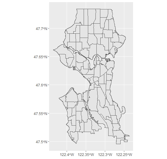
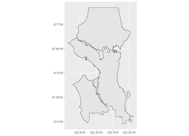
Starting with the City Clerk shapefile of the neighborhood boundaries, I’ll import the file with read_sf():
neighborhoods <- read_sf("project/data/City_Clerk_Neighborhoods.shp")
We can immediately map the file with ggplot to see what looks like:
ggplot() +
  geom_sf(data = neighborhoods)
And we can see with head() what the data looks like:
OBJECTID PERIMETER S_HOOD L_HOOD L_HOODID SYMBOL SYMBOL2   AREA   ...
     <dbl>     <dbl> <chr>  <chr>     <dbl>  <dbl>   <dbl>  <dbl> ...
1       1.      618. OOO    NA           0.     0.      0.  3588. ...
2       2.      734. OOO    NA           0.     0.      0. 22295. ...
3       3.     4088. OOO    NA           0.     0.      0. 56695. ...
4       4.     1809. OOO    NA           0.     0.      0. 64157. ...
5       5.      250. OOO    NA           0.     0.      0.  2993. ...
6       6.      409. OOO    NA           0.     0.      0. 11371. ...
There are other variables as well. If you notice the last, geometry, you can see that the data also includes a variable for the geometries of the polygons in the shapefiles.
For my purposes, I want to simply look further at the S_HOOD variable, which has the City Clerk’s names for each of the major neighborhoods. I will want to join, later, on this variable. One matter of data cleaning: we can drop the areas where S_HOOD has a value of NA. I have checked, and these mostly small areas such as Kellogg Island, which should be connected to neighborhoods rather than considered seperate. A quick use of dplyr’s drop_na() can do that, which we can pipe, rather than repeatedly assign the variable. Though in this case the code is just about as long either way, it is good habit and leads to more readable code:
neighborhods <- neighborhoods %>% drop_na(S_HOOD)
One last matter before moving on to the collisions data: it is important to determine (and, for later, retrieve) the coordinate reference system from the shapefile-become-sf:
s_crs <- st_crs(neighborhoods)
Now I’ll import the collisions data. I also do some data wrangling because of the way the file is organized. I’ll begin with the import:
collisions <- read.csv("project/data/collisions.csv", stringsAsFactors = FALSE)
This data is tidy: the columns specify variable names, the rows specify cases. There’s only a little bit of wrangling to do. First, I’ll change the first variable name in the csv, which is hard to manipulate, and drop the rows which have locations but no other information (a few of which are in the dataset), using drop_na(), this time with all fields specified. The reasoning is that if there is a missing value, especially in the first two fields, we can’t plot it. Of course, these data wrangling tasks should be done with care and attention to how they affect the entire analysis:
# Change a misnamed column name in the csv
names <- colnames(collisions)
names[1] <-"X"
colnames(collisions) <- names
collisions <- collisions %>% drop_na()
Then I will filter to retrieve the collisions from 2018. This involves some data manipulation with dplyr. First, I select only the x and y columns and the date variable. I choose to rename the variables as I go (by specifying first the desired field name just for ease of reference. Then I create a field with mutate() in which I extract the first four characters of the date variable. For this I use the substring function substr, in which I specify the point to start and stop extracting characters in the date string. Since I am only going to be using dates from 2018, I actually replace the old date field by assigning it the same variable name (“date”). From there, I filter for the values of 2018 and then drop the date field, leaving me with just the coordinates:
collisions <- collisions %>%
  select(x = X, y = Y, date = INCDATE) %>%
  mutate(year = substr(date, start = 1, stop = 4)) %>%
  filter(year == "2018") %>%
  select(-date)
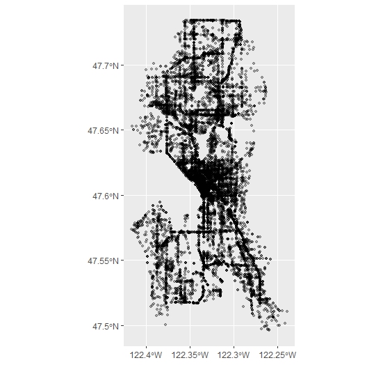
Next, I take the resulting collisions data frame and turn it into a sf object. The City of Seattle confirms that the coordinate reference system is the same as the shapefile of the neighborhoods (WGS-84 or EPSG:4326), and so I set it to the crs variable I extracted from that shapefile:
collisions_sf <- st_as_sf(collisions,
                   coords = c('x', 'y'),
                   crs = s_crs,
                   remove = F)
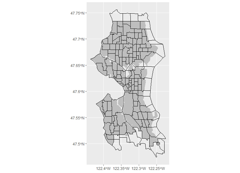
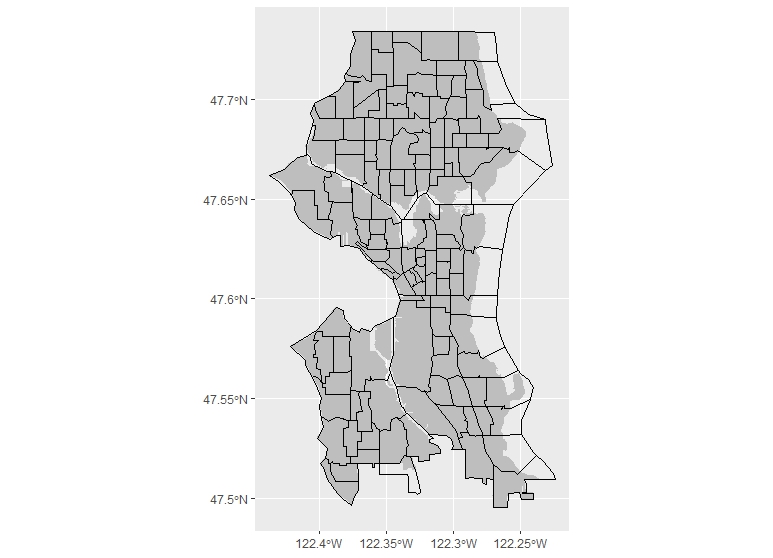
We can plot the result. This takes a little while with ggplot given the size of the data frame. I have changed the alpha transparency of the points to make their frequency easier to display:
ggplot() +
  geom_sf(data=collisions_sf, alpha=.3)
1.3 Spatially Joining the Data
Now we can join the data. I use st_join to specify a spatial join, and also specify that we want the collisions_sf shape joined to the neighborhoods shape. I will also make clear that I want all the collisions completely within the neighborhoods to be joined (this can be modified to include any of the usual qualities, including intersecting, touching, etc.):
collisions_join <- st_join(collisions_sf, neighborhoods, join = st_within)
We can see the results of the join, where the x and y variables of the collisions dataframe now have variables of the neighborhoods data joined to them:
x        y OBJECTID PERIMETER            S_HOOD           ...
1 -122.3329 47.70956      112  29413.55       Haller Lake ...
2 -122.2794 47.51707       81  38996.71 South Beacon Hill ...
3 -122.2907 47.69020       96  23840.22          Wedgwood ...
4 -122.3498 47.64651       46  26753.56  North Queen Anne ...
5 -122.3300 47.61226       63  13225.23        First Hill ...
6 -122.3050 47.60217       55  18241.55             Minor ...
1.4 Summarizing the Data
Now we want to count how many crashes are within the each neighborhood, and visualize the result. Since the sf objects are data frames, this operation can be done simply by summarizing the data as one would normally do with the group_by() and summarize() workflow of dplyr, here group_by(), which will be set to the S_HOOD variable and count() (a quick call to just count() would have been sufficient, but I wanted to specify the variable name for future reference.)
The only additional step I have to consider in this operation is that we have to set aside the geometry data which attaches to each case of the spatial data, in order to perform the count. Freed of the geometries, we can then re-attach them by joining them the back to the original neighborhoods dataset. To do this, I then make a quick call to as.data.frame() before peforming the grouping and summarizing:
collisions_count <- collisions_join %>%
  as.data.frame() %>%  #Use this to remove the sticky geometry
  group_by(S_HOOD) %>%
  summarize(collisions_n = n())
This gives us the number of collisions per neighborhood:
S_HOOD          collisions_n
 <chr>         <int>
1 Adams           164
2 Alki             69
3 Arbor Heights    23
4 Atlantic        244
5 Belltown        437
6 Bitter Lake     146
(As an aside, this detaching and re-attaching geometries here has to be done because sf can’t yet join spatial objects to spatial objects directly. But as you can see, it makes intuitive sense from within the workflow to see geometry data as “sticky”: the workflow is from extracting and manipulating the spatial data variables like any other tidy data, then joining the variables back to the data they came from, when they want to be used in context with all the other variables. The sf workflow just allows the geometries to unstick and stick back on when we want them.)
1.5 Visualizing
As mentioned above, we have to join the count data back to the original neighborhood data in order to see it in context with the rest of the variables. Just as in any GIS interface, there’s no need for any spatial joins here at all, but just a joining of the data: sf lets me just do this with a simple left_join() on the S_HOOD variable.
neighborhood_collisions <- left_join(neighborhoods,
                                     collisions_count,
                                     by="S_HOOD")
Now let’s plot the finished product with ggplot(). With a simple call to geom_sf(), mentioned earlier, we can specify that the fill should be the new variable we created which counts the number of collisions. I here also specify a scale fill, with some colors, and use the comma argument from the scales package to make sure that the data doesn’t display in scientific format in the legend. After setting the theme with theme_bw(), the final thing is to remove the axis text and ticks:
ggplot() +
  geom_sf(data = neighborhood_collisions, aes(fill = collisions_n)) +
  labs(fill = "Collisions in 2018") +
  scale_fill_continuous(low = "grey90",
                        high = "darkblue",
                        labels=comma)+
  theme_bw() +
  theme(axis.text.x = element_blank()) +
  theme(axis.text.y = element_blank()) +
  theme(axis.ticks.x = element_blank()) +
  theme(axis.ticks.y = element_blank())
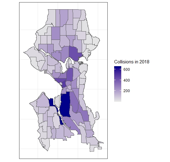
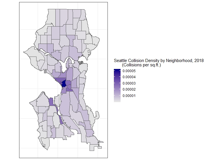
However, a common operation would be not plotting just the count but the count per area. The City Clerk neighborhood’s file has this already calculated in square feet in the AREA field and so a simple change of the fill argument to collisions_n/AREA will plot the collisions per sq.ft., a more accurate and informative chloropleth map. If we wanted to make the calculation ourself, however, st_area() in sf allows us to do this (with the help of the lgeom package, which must be loaded), and the units package to convert the result, which is in square meters, to square feet. We then simply add this variable (after converting it to a decimal result) to our data (we can just use $) and use mutate to add another variable which would be the collisions per square foot. This then can be used for plotting the more accurate map:
library(lwgeom)
library(units)
neighborhood_areas <- st_area(neighborhood_collisions)
units(neighborhood_areas) <- with(ud_units, ft^2)

neighborhood_collisions$areas <- as.numeric(neighborhood_areas) #add row, convert to numeric

neighborhood_collisions <- neighborhood_collisions %>%
  mutate(collisions_sqft = collisions_n/areas)

ggplot()+
    geom_sf(data = neighborhood_collisions, aes(fill = collisions_sqft)) +
    labs(fill = "Seattle Collision Density, 2018 (Collisions per sqft.)") +
    scale_fill_continuous(low = "grey90",
                          high = "darkblue",
                          labels=comma)+
    theme_bw() +
    theme(axis.text.x = element_blank()) +
    theme(axis.text.y = element_blank()) +
    theme(axis.ticks.x = element_blank()) +
    theme(axis.ticks.y = element_blank())
1.6 Other Operations: Joins and the Census
We can also perform another common operation, which is to join this data to census tracts. In what follows, we will use the tigris package.
Our tasks will be, then:
- Dissolving the neighborhood boundaries object to obtain a city boundary
- Downloading Census data and selecting those within the city boundaries
- Joining the collision data to the tracts
We can dissolve the city neighborhoods by simply creating a group within the sf which includes all of the neighborhoods, and summarizing over them:
s_city <- neighborhoods %>%
  mutate(group = 1) %>%
  group_by(group) %>%
  summarize()
The result is what you would expect, a dissolved polygon:
Now, let’s get the census tracts. We can set the environment so that we download simple features data with the tigris package, and put it in the cache as we work (rather than download it to a directory). Then with a call to tracts() we download the county data (specifying cb as true for a simpler geometry, rather than a 500k resolution geometry):
library(tigris)

options(tigris_class = "sf")
options(tigris_use_cache = TRUE)
s_tracts <- tracts(state="WA", county="King", cb=TRUE)
You can check if the census tracts are all sf objects by way of st_is_valid, which will check each polygon and return TRUE or FALSE, depending. Wrapping that in base R’s all(), which checks if all values are true–as in all(st_is_valid(s_tracts))–returns TRUE.
Next, we transform the tracts sf from its coordinate reference system into the reference system used by the Seattle census tracts:
s_tracts <- st_transform(s_tracts, crs=s_crs)
And then extract the census tracts which overlap with the city boundaries by simply subsetting one to the other. We can do this two ways. First, we proceed with a filter() which would keep everything in the s_tracts spatial data frame which did not intersect with the city boundaries. This is possible with st_intersect, which checks for exactly this, then returning the length() of the result, which is 0 or 1. We want to keep everything greater than 0, so we then pass this to filter():
s_city_tracts <- s_tracts %>% filter(lengths(st_intersects(s_tracts, s_city)) > 0)
Alternatively, and as some have pointed out, we can just perform this clip just as if we were subsetting one dataframe by another, as we would normally do:
s_city_tracts <- s_tracts[s_city,]
Plotting this shows us the census tracts overlaying our dissolved city limits polygon.
Now there is a problem which will produce a need for some further data wrangling. Some of the tracts share edges with the border of the city, and so were not left out when we subsetted the data. We can clean this if we want in two ways: either we can go back and, instead of subsetting the tracts by what is intersecting with the city border, we can do a join specifying that only areas within the city borders will be kept. This may, however, not work exactly if you have overlapping files (in our case, we do, because we are using different jurisdictional borders–this case appears often when using city boundaries). Alternatively, because the data is simple features data and works like a table, we can simply look in the tracts and drop the cases which include the tracts outside the border. The tradeoff with the latter approach is that it is only really useful where small amounts of tracts need to be excluded: it isn’t practical for large datasets. For simplicity’s sake, however, I’ll do the latter, though it is time-intensive, because it shows another great feature of dealing with simple feature data, which is that ggplot can immediately label things for you with a call to geom_sf_text() or geom_sf_label(). We’ll use the latter, with the TRACTCE variable, which will show tract numbers. We can then subset based on that:
ggplot(data=s_city_tracts) +
  geom_sf(data=s_city, fill="grey",color=NA)+
  geom_sf(fill=NA, color="black")+
  geom_sf_text(aes(label=TRACTCE))


s_city_tracts <- s_city_tracts %>%
  filter(! TRACTCE %in% c("020900", "021000",
                          "021100", "021300", "026400", "026100",
                          "026700","026600", "026300", "026001"))
Once we do this, we have the set of data we want to work with.
We can then go about all of the spatial joining to the census tracts just as we did above, and the calculations for density by the tract’s area in square feet. This gives us another detailed map when we plot it:
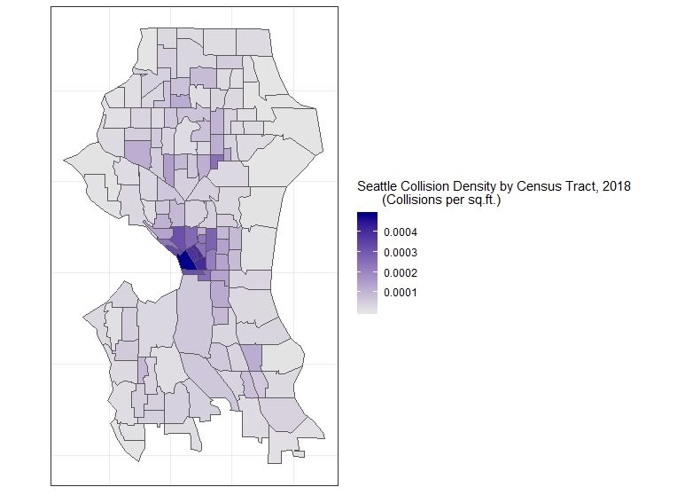
Now we can fetch data from the Census and look for spatial correlations (which, as in this example, might be tenuous), or simply research using the Census data with the addition of the data we joined.
1.7 Looking for Trends with Census Data
We can download Census data with the acs package, and Kyle Walker’s handy tidycensus, which uses acs. The acs package, an immensely useful tool developed for planners, economists, and anyone who uses census data, was put together by the data division of Puget Sound Regional Council. It requires an API key, which can be obtained easily from the U.S. Census Bureau. See help(package="acs") for instructions on how to set this up easily, with a quick use of api.key.install(key="YOUR API KEY"). Walker’s tidycensus uses acs but makes the process even easier by returning fetched data directly as tidy data frames. Even more useful, it uses tigris to join the data to the TIGER simple feature geometries, if you like. We don’t need to do that because of our previous step, but we will use it to fetch the census data. So, our workflow will look like this:
- Fetch Census data
- Wrangle for the kinds of data we want
- Join to our data based on collisions
- Look for trends
First, let’s fetch the data. We will be looking at a table familiar to many planners, American Community Survey data table B08141 on the means of transportation to work. It shows a breakdown of the various means of transportation for every census tract, and can be used to inform and justify policy decisions which would improve transportation planning in certain areas. What I want to see for the purposes of this introduction is something at once very basic and also complex: the varying degrees of car ownership of the households and the number of collisions per square foot. Notice that the table itself has many more demographic characteristics, including means of transportation to work: perhaps one of these may be better to use if we are looking at the relationship of collisions to the demography of neighborhoods. More on this later. For now, let’s do the work of fetching the data.
The data can be retrieved with the tidycensus function get_acs(). This assumes a little familiarity with acs, and I recommend looking at the latter more in depth to get a handle on exactly how to fetch data. But if you know how to work with Census data normally, the method is intuitive: you spend a lot of time making a geography for the data you want to retrieve, and then you specify the tables from which you want to fetch data, then usually wrangle it into a tidy data frame. tidycensus makes this even easier than acs, and does this all in one go: in the arguments, you specify the geography of the data you want, the table, and where you want it from. What’s more, it uses tigris just as we did above to append simple feature data to the geography, if you specify TRUE in the geometry argument. I am specifying FALSE because we already have that data:
library(tidycensus)
# Make sure API key set up

s_acs <- get_acs(geography = "tract", table = "B08141",
                state ="WA", county="King County", geometry = FALSE)
We now have the data. Each tract is specified with a GEOID and a NAME, and variables are listed as variable. In American Community Survey data, like we are using here, the margin of error is specified in the moe field:
GEOID       NAME                                    variable   estimate   moe
  <chr>       <chr>                                   <chr>         <dbl> <dbl>
1 53033000100 Census Tract 1, King County, Washington B08141_001    4060.  401.
2 53033000100 Census Tract 1, King County, Washington B08141_002     101.   61.
3 53033000100 Census Tract 1, King County, Washington B08141_003    1871.  356.
4 53033000100 Census Tract 1, King County, Washington B08141_004     972.  293.
5 53033000100 Census Tract 1, King County, Washington B08141_005    1116.  371.
6 53033000100 Census Tract 1, King County, Washington B08141_006    2224.  370.
While acs’s acs.fetch() returns a description of the variable, tidycensus assumes you are pretty certain of the variables you want. If you are uncertain of what you are looking for but know the table you want to look up, you can use acs or simply look at the table on the Census website to confirm: for example, B08141_001 is the variable showing the total number of households in the tract, while B08141_002 shows the total number with no vehicles available to travel to work, and B08141_005 shows the total number with three cars or more available.
What I will do next is use dplyr to filter for these three variables with the %in% operator, which looks within a string of characters where we place the three fields we want. Next, I drop the moe field, then spread() the data across three fields. This will turn the data frame from one which has variables arranged by census tract to one where each census tract has the three variable fields we want to consider (it can be undone with gather()). We can then use the latter to make calculations with mutate(), and specify the number of households with cars available, the number with no cars, and the number with three or more cars available, which we will later reduce to a density (per square foot of the census tract, a figure we already have):
s_popcars <- s_acs %>%
  filter(variable %in% c("B08141_001", "B08141_002", "B08141_005")) %>%
  select(-moe) %>%
  spread(key=variable, value=estimate) %>%
  rename(total=B08141_001, nocars=B08141_002, threecars="B08141_005") %>%
  mutate(pctcars = (total-nocars)/total) %>%
  mutate(pctnocars = nocars/total) %>%
  mutate(pctthreecars = threecars/total)
Now that we have that complete, we can make the join to the previous data which had census tracts, and keep all we need with select():
s_cars <- left_join(tract_collisions, s_popcars, by="GEOID") %>%
  select(GEOID, collisions_sqft, pctcars, pctnocars, geometry)
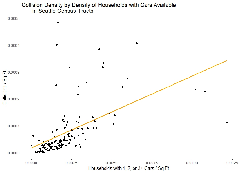
Now, if we plot this data, we can see certain trends. First let’s start with the amount of households which do not have cars available per area vs. the number of collisions per square foot in each tract. A simple point plot will be able to display the trend, and stat_smooth() can also display what an ordinary least squares regression model (lm) looks like on the data:
ggplot(s_cars, aes(x=cars/areas, y=collisions_sqft)) +
  geom_point()+
  stat_smooth(method="lm", color="Orange", se=FALSE) +
  labs(title="Collision Density by Density of Households with Cars Available
       in Seattle Census Tracts")+
  xlab("Households with 1, 2, or 3+ Cars / Sq.Ft.")+
  ylab("Collisions / Sq.Ft.")+
  scale_x_continuous(labels=comma)+
  scale_y_continuous(labels=comma)+
  theme_classic()
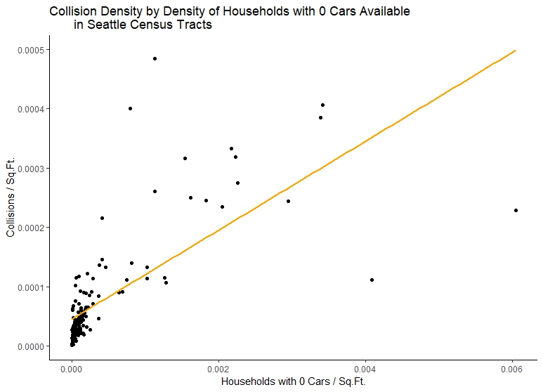
Now let’s look at collision density vs. the density of households without cars:
ggplot(s_cars, aes(x=nocars/areas, y=collisions_sqft)) +
  geom_point()+
  stat_smooth(method="lm", color="Orange", se=FALSE) +
  labs(title="Collision Density by Density of Households with 0 Cars Available
       in Seattle Census Tracts")+
  xlab("Households with 0 Cars / Sq.Ft.")+
  ylab("Collisions / Sq.Ft.")+
  scale_x_continuous(labels=comma)+
  scale_y_continuous(labels=comma)+
  theme_classic()
We could continue to explore the data in this way, and build better models using other Census data. This, and the changing of the geographies, is essentially how transportation planners have constructed Traffic Analysis Zones, and how they document trends concerning them. However, by way of bringing this to a close, we should note how little we have modeled to produce these results compared to more sophisticated transportation planning analyses, and, especially, how little there is a basis for concluding anything about the relationship between collisions and the mode of travel in each census tract.
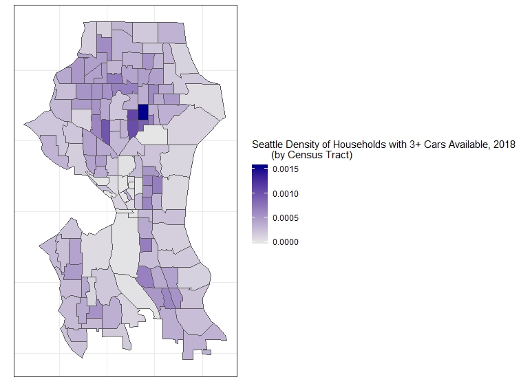
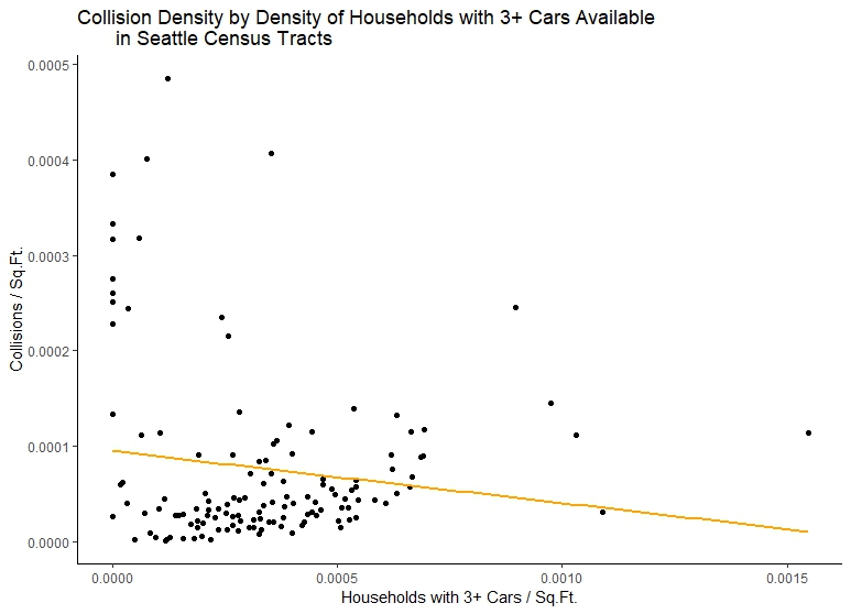
Let’s be clear: our initial exploration of trends appears to show that we have positive relationship between collisions per square foot and the density of households with cars. But this relationship is still very unclear. We see this from comaring first plot to our second, which, while showing a steeper positive relationship also, has less frequency of collisions as the density of households with no cars available increases. One might conclude there is not really a realtionship between the number of collisions and the number of households with cars available from this data. In fact, if we plot our third census variable, we could come up with the opposite idea: that neighborhoods with more cars available have lower collision density!
This is not to introduce skepticism concerning our work, just to make clear that they are not results, but moments in the data exploration phase, useful to building a more robust model. This is immediately explained by mapping households with no cars available and with three or more cars, which is something now completely familiar to us:
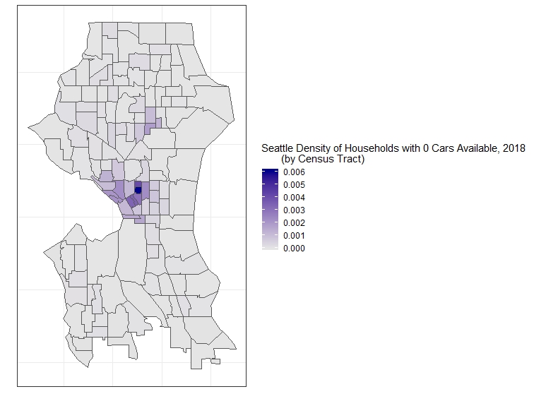
ggplot()+
  geom_sf(data = s_cars, aes(fill = nocars/areas)) +
  labs(fill = "Seattle Density of Households with 0 Cars Available, 2018
       (by Census Tract)") +
  scale_fill_continuous(low = "grey90",
                        high = "darkblue",
                        labels=comma)+
  theme_bw() +
  theme(axis.text.x = element_blank()) +
  theme(axis.text.y = element_blank()) +
  theme(axis.ticks.x = element_blank()) +
  theme(axis.ticks.y = element_blank())
ggplot()+
    geom_sf(data = s_cars, aes(fill = threecars)) +
    labs(fill = "Seattle Density of Households with 3+ Cars Available, 2018
         (by Census Tract)") +
    scale_fill_continuous(low = "grey90",
                          high = "darkblue",
                          labels=comma)+
    theme_bw() +
    theme(axis.text.x = element_blank()) +
    theme(axis.text.y = element_blank()) +
    theme(axis.ticks.x = element_blank()) +
    theme(axis.ticks.y = element_blank())
Clearly, the relationship of collisions and households has to do with larger patterns in the urban form, including the walkability and bikability of the city, and also the sheer amount of activity within the core versus many of the outer neighborhoods (which might account for collisions showing a negative relationship with households with 3+ cars available). While we have accounted for some of this by using densities rather than counts, we have not at all considered the density of traffic or interactions between travelers, and the differences in available modes as a function of the differences in the infrastructure.
So, most fundamentally, we must go back to the basic assumption behind much of the exploration we have already done, and consider whether looking at demographic data based on one or two variables about census tracts can tell us anything remotely about collisions at all in the areas of the city where they appear (we also must consider collisions which emerge not because of local interactions, but interactions between local and non-local travelers). Again, this is not to undermine our faith in the data, just to underline the need for much more data exploration in order to build a model. What is encouraging is that model building, as every one dealing with these types of data know, is an iterative process: I hope that the tools above help make the phases of data exploration much easier to accomplish.
1.8 Conclusions
As you can see, you can do these common GIS operations rather easily. The only additional thing we may want to do, for now, is write our manipulated data to a shapefile with a simple call to write_sf():
write_sf(neighborhood_collisions,
  "project/data/neighborhood_collisions.shp",
  delete_layer = TRUE)
And our joined US Census Data:
write_sf(s_cars, "project/data/s_cars.shp",
  delete_layer = TRUE)
There even more things we can do with everything we’ve done now within R. I will have further introductions to spatial analysis with these workflows in the future.
In the meantime, for more information on visualizing the data in a more sophisticated manner than I have attempted here, you may want to check out r-spatial’s great series of posts on making maps in R, which also involve including many of the traditional cartographic elements useful for presentation-quality material. You might also want to see the sf package’s documentation for more information, in particular their cheatsheet, which works as a handy graphical summary of the package’s approach to many common spatial data manipulation operations. You may also want to check out the tigris, acs and tidycensus packages for info on easily retrieving and manipulating census data with R.