Runs and wins: regression with tidy data
A quick update to a chapter on analyzing baseball data
A great book for learning R is Analyzing Baseball Data with R by Mack Marchi and Jim Albert. Besides being a great book about how to automate a lot of tasks in baseball analytics, the book provides a context for many of the data analysis workflows that are able to be automated in R: if you know a little about baseball you can get a really great feel for many data analysis tasks, and vice versa.
Unfortunately, because the book was published in 2013, there’s little support in the text for tidy data workflows and a lot of use of base R: lots of subset(), lots of with(), and lots of plotting with plot() rather than ggplot(). This is good, on the one hand, because base R is already intuitive and useful and sometimes the tidy data framework (particularly ggplot) is not always the foolproof solution to a lot of problems. However, since the tidy data framework is generally even more intuitive and also so very extensible for many data analysis tasks, I’ve decided to give an indication of how some of the analyses might change.
1.1 The relation between runs and wins
Chapter 4 of Marchi and Albert’s book covers the relation between runs and wins. Specifically it follows the very interesting question of whether run differential matters in baseball. Run differential is the difference between the winning team’s runs and the runs of the opponent, or how much a team beat their opponent by. All a team has to do to beat an opponent, of course, is one more run than them. But not all opponents are beaten equally, as it were. Some teams may beat their opponents by a lot, in order presumably to protect their leads. Baseball can be a streaky game: few runs are scored, until when several people get on base, and then they can be all knocked in at once. On the other hand, some teams may play more defensively, keeping their opponents to low scores, and then squeaking by. Looking at the distribution of run differentials across teams’ seasons shows this:
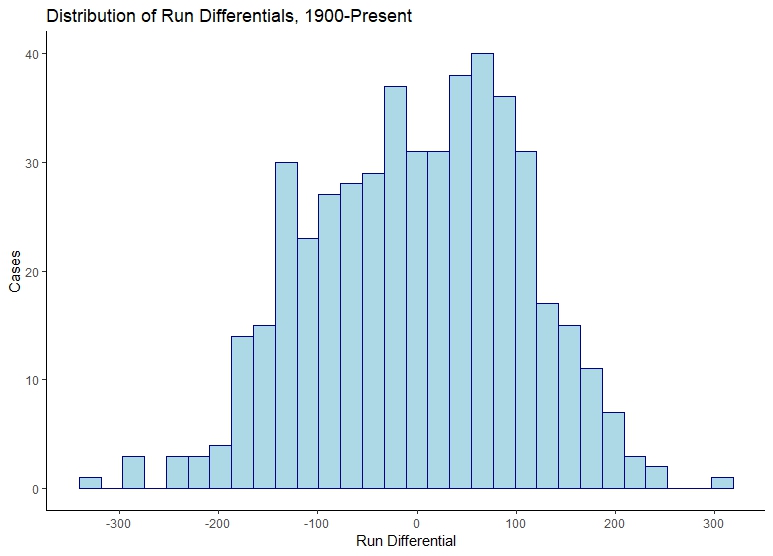
We can also look at the summary statistics:
- Minimum: -349
- Median: 5
- Mean: 0
- Maximum: 411
The median run differential for the 2452 team-seasons played since 1900 is a remarkable number: 5 runs scored more than allowed across the entire season. On average–even more remarkably– teams scored no more runs than they allowed by the other team in each season. The distribution shows this well: most cases are precisely around 0, with a peak just below and just above 0.
1.2 A remark on regression
However, it is the information other than that able to be gathered by looking at central tendency which we will be concerned with, since each of the teams here may have had different outcomes in terms of their success at winning.
It’s important to review what we are trying to do when we say something like this, before we proceed. What we are doing in linear regression is trying to see if a distribution of a variable can be related linearly to another variable. We are trying to relate one variable to another by making it dependent on that variable in order to get a better answer about any and every variable. This allows us to find out more information using the model: given a certain run differential, we should be able to tell more about the winning percentage, in the sense that it should be able to be an element of a series which would fall on a line of other relationships between run differential and winning percentage. While our model may give us a precise answer, and the actual world may be more messy than that, we have nevertheless provided a link between two variables that is plausible. To use the language of some econometricians (specifically, Philip Hans Frances), this link allows us to shift from unconditional to conditional expectations, or an expectation that depends on a linked variable.
1.3 Calculating basic stats
First, let’s import libraries. We will use Lahman, an R package maintained by Chris Dalzell which allows you to access Sean Lahman’s amazing baseball database easily, with its comprehensive team statistics. We will also use the tidyverse package, for tidy data manipulation. Finally we will want broom, by Alex Hayes, which has tools for taking statistical test output and placing it in a tidy data format.
library(Lahman)
library(tidyverse)
library(broom)
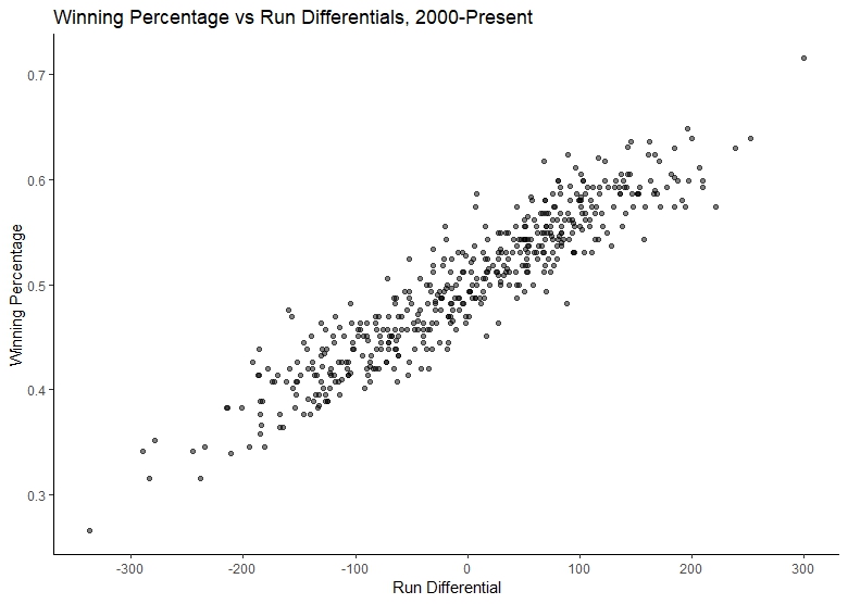
Next, we can subset the data table on teams data which is accessible thanks to the Lahman package in the variable Teams. Marchi and Albert are concerned with run differentials from all teams from season 2000 onward, and I’ll follow them. However, I will not use subset() from base R to subset the data and keep the crucial fields I need. Insteaad, I will use dplyr and filter() applied to Teams to remove all values before 2000 using the yearID variable in the dataset, and select() to retain crucial fields for calculating run differential. This will include the team id, the year, league id, total games played, total wins, total losses, runs scored and runs allowed:
t <- Teams %>%
  filter(yearID > 2000) %>%
  select(teamID, yearID, lgID, G, W, L, R, RA)
Next, we can calculate the run differential by subtracting the runs allowed (RA) from runs (R), and add this as a separate column to our dataframe with mutate(). Then, we similarly calculate the win percentage (which Marchi and Albert make clear is actually better named a win proportion), by dividing the wins (W) from the total amount of games (wins plus losses, or W plus L):
t <- t %>%
  mutate(rundiff = R-RA) %>%
  mutate(wpct = (W/(W+L)))
If we look at the five number summary of run differentials with summary(), we see:
- Minimum: -337
- First Quartile: -78.25
- Median: 4.5
- Mean: 0
- Third Quartile: 78.5
- Maximum: 300
And if we look at the five number summary of winning percentage with summary(), we see:
- Minimum: .265
- First Quartile: .444
- Median: .505
- Mean: .500
- Third Quartile: .556
- Maximum: .716
That should give us some expectation of just how much run differentials can translate into winning percentages in the furst place: clearly no one is winning all the games and even the lowest performing team is winning roughly a quarter of their games (.265, to be exact). However, we can plot the two against each other to test the general assumption, which to Marchi and Albert seems obvious but which I treat with a little more hesitation, that greater run differential may translate into a higher winning percentage:
p <- ggplot(data=t, aes(x=rundiff, y=wpct))+
  geom_point()+
  labs(title="Winning Percentage vs Run Differentials, 2000-Present")+
  xlab("Run Differential")+ylab("Winning Percentage")+
  scale_x_continuous(breaks=seq(from=-400, to=400, by=100))+
  theme_classic()
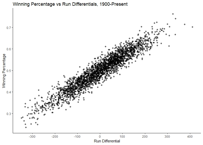
If we do the same work and look at the data from 1900, this pattern becomes even more clear:
1.4 Building a model
We can understand this association in two ways: we can understand even better the actual historical association, or we can build a model to understand the expected winning percentage given a particular run differential. Marchi and Albert do the latter.
First, we suggest the model:
Winning percentage = a + b * run differential + residuals
And we make the linear model with lm(). We keep the data specified at the end of the function call because it allows us to focus on specifying (and if need arises, modifying) the actual model itself:
fit <- lm(wpct ~ rundiff, data=t)
Instead of viewing the results with summary() in base R, we can use tidy() from the broom package:
tidy(fit)
This returns the summary output of lm() as a tidy data frame. (This is not only useful in the moment, but is particularly useful if we would like to work with multiple models.) We will pay attention to the estimate variable:
# A tibble: 2 x 5
  term        estimate std.error statistic   p.value
  <chr>       <dbl>     <dbl>     <dbl>     <dbl>
1 (Intercept) 0.500     0.00116    433.      0.
2 rundiff     0.000626  0.0000110  57.1      1.31e-215
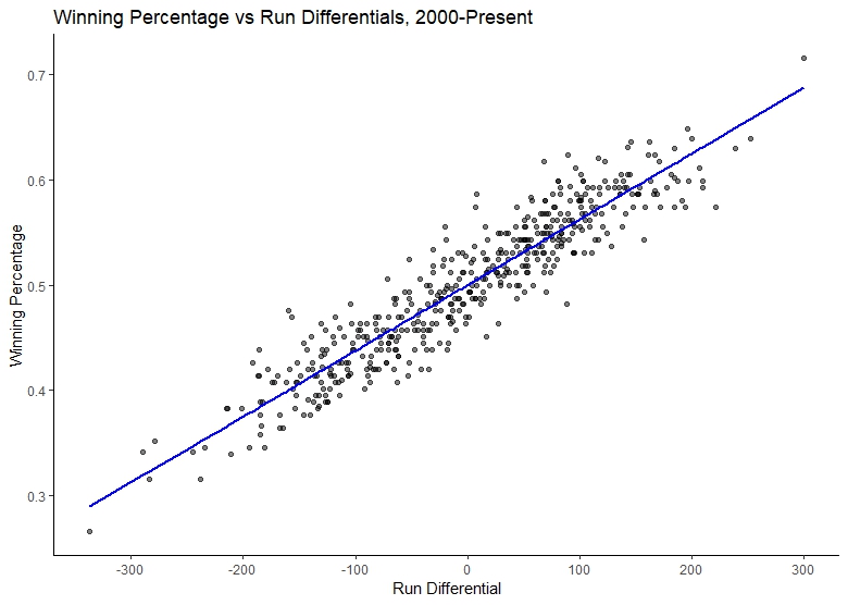
Marchi and Albert explain the estimate variable and its two cases: a team with a run differential of zero will win half of its games (.500, the intercept), and a one run increase in a season’s run differential will correspond to a .00626 increase in winning percentage. The model, in other words, can be expressed:
Winning percentage = .500 + .00626 * run differential + residuals
We can use broom and its function augment() to return the team data with the fitted values and residuals added (automating a common workflow in base R):
fitaug <- augment(fit)
This returns a tibble with everything we need to know more about each of the values:
# A tibble: 480 x 9
    wpct rundiff .fitted .se.fit   .resid    .hat .sigma   .cooksd .std.resid
 * <dbl>   <int>   <dbl>   <dbl>    <dbl>   <dbl>  <dbl>     <dbl>      <dbl>
 1 0.463     -39   0.476 0.00123 -0.0126  0.00237 0.0253 0.000296      -0.499
 2 0.568     141   0.588 0.00193 -0.0203  0.00581 0.0253 0.00190       -0.806
 3 0.543      86   0.554 0.00149 -0.0106  0.00347 0.0253 0.000307      -0.420
 4 0.391    -142   0.411 0.00194 -0.0198  0.00586 0.0253 0.00182       -0.786
 5 0.509      27   0.517 0.00119 -0.00757 0.00222 0.0253 0.0000998     -0.300
 6 0.512       3   0.502 0.00116  0.0105  0.00209 0.0253 0.000179       0.414
 7 0.543      76   0.548 0.00142 -0.00435 0.00317 0.0253 0.0000470     -0.172
 8 0.407    -115   0.428 0.00171 -0.0206  0.00456 0.0253 0.00153       -0.816
 9 0.562      76   0.548 0.00142  0.0142  0.00317 0.0253 0.000499       0.561
10 0.451      17   0.511 0.00117 -0.0600  0.00214 0.0252 0.00603       -2.37
# ... with 470 more rows
It can also be easily joined to the original team data with a simple left_join(). It also allows a much easier way to plot with ggplot. We can use the same plot as our previous one, only with an extra line added which uses the new data frame and the .fitted variable:
p+
  geom_line(data=fitaug, aes(x = rundiff, y = .fitted), size = 1, color="red")
p
All this would have to be achieved with a rather unintuitive set of calls to predict() in base R. Finally, we can look at the R-squared value and confirm the goodness of fit with a glance() in broom. glance(fit) returns:
# A tibble: 1 x 11
  r.squared adj.r.squared  sigma statistic   p.value    df logLik    AIC    BIC deviance
*     <dbl>         <dbl>  <dbl>     <dbl>     <dbl> <int>  <dbl>  <dbl>  <dbl>    <dbl>
1     0.872         0.872 0.0253     3260. 1.31e-215     2  1085. -2163. -2151.    0.306
# ... with 1 more variable: df.residual <int>
The r-squared value is 0.872, and the root mean standard error, which Marchi and Albert calculate, is listed in the sigma variable as 0.0253. Finally, we can further investigate the model by plotting a quick residual plot using the broom augmented model data, plotting the .fitted variable against the .resid variable. In order to be clear about which teams’ seasons are least captured by the model (or rather, where our residuals are the greatest), we can also create labels and pass this to the residual plot with geom_text(). First, we merge the augmented model (fitaug) back with our team data (t), taking time to create a label column with mutate() which combines the team id and their season. Then we simply specify the label in the aesthetic and tack on a geom_text() to our plot, making sure to filter out everything but the least extreme values (here, anything with residuals greater than .07):
fitaug <- left_join(t, fitaug, by = c("rundiff", "wpct")) %>%
  mutate(label = paste(teamID, yearID))

ggplot(data=fitaug, aes(x=.fitted, y=.resid, label=label))+
  geom_point(alpha=.3)+
  geom_hline(yintercept=0, col="red", linetype="dashed")+
  labs(title="Residual Plot")+
  xlab("Fitted Values")+ylab("Residuals")+
  geom_text(data=filter(fitaug, .resid > .07 | .resid < -.07),
            nudge_x=.025)
  theme_classic()
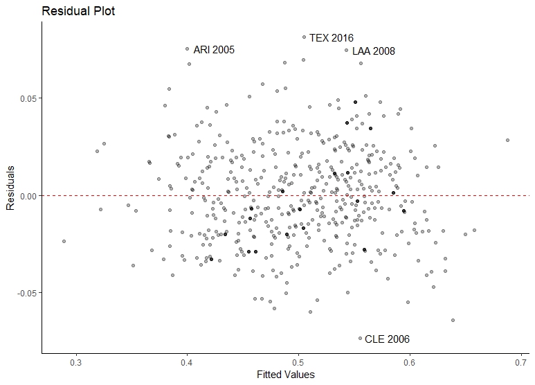
We see that the 2005 Arizona Diamondbacks, the 2006 Cleveland team, the 2008 Los Angeles Angels, and the 2016 Texas Rangers all have high residuals. A quick look at their run differential compared to their winning percentage shows why:
teamID yearID lgID   G   W  L   R  RA rundiff      wpct      .resid
1    ARI   2005   NL 162  77 85 696 856    -160 0.4753086    0.07544339
2    CLE   2006   AL 162  78 84 870 782      88 0.4814815   -0.07358386
3    LAA   2008   AL 162 100 62 765 697      68 0.6172840    0.07473474
4    TEX   2016   AL 162  95 67 765 757       8 0.5864198    0.08141895
Arizona had a very large negative run differential but still a rather average winning percentage (near the median of .500 and between the first and third quartile, see our consideration of it above). Cleveland had high differentials but average winning percentage; Texas had a small run differential with a high winning percentage. Finally, the Angels had run differential within the first and third quartiles (and somewhat close to the mean) and a high winning percentage. If the relation between run differentials and winning percentages are to be better understood, a more complex model may need to be built.
1.5 Conclusion
In the end, the tidy data format allows much cleaner code, much more familiar and intuitive operations with data, and also works well with visualization to make it a compelling alternative to many base R workflows. I hope this modification to one basic exercise in Marchi and Albert’s excellent book is helpful, and shows the ways that some approaches there and elsewhere might be updated.